Visualizations

Below you will find a sample of my visualizations (interactives, movies and images). Large images are hosted Google Drive, and videos are hosted on YouTube. If you desire the video file for offline use, or any other file related to the visualizations on this page, please contact me at the email provided at the bottom of the page. Use freely, but please give appropriate credit: Generally all can be credited with Aaron M. Geller - Northwestern University, but also see the more detailed credit lines for each section.

Visit my YouTube channel here.


Quick Links to Categories
3D Online Interactives
Firefly snapshot

Firefly : As datasets of all kinds become larger and more complex, exploring and extracting information from them has become commensurately more difficult. On the other hand, large and complex data sets are often ripe for serendipitous scientific discovery. At the interface of this tension is the work of data visualization tools like Firefly, an innovative application that Alex Gurvich and I have been developing for the past few years.

Firefly is an open-source web application that allows users to interactively explore and share 3D particle data. At its core, Firefly is a Javascript app that uses WebGL to efficiently render millions of particles simultaneously in an interactive scene, using the three.js library. The app includes an expansive user interface which can be customized using a configuration file, allowing users to create visualizations for different audiences and use cases without changing the underlying code or data. Users can explore their data using Firefly both within a browser and also as part of a Python workflow within a Jupyter notebook. Firefly was originally written as an interactive particle viewer for FIRE data but has since been expanded and generalized for any 3D particle data set. Firefly allows you to explore 3D particle-based data in real time with many options to change (e.g., filter, recolor, resize, etc.) the data that is shown. There is also a stereo mode that allows users to view the simulations in passive left-right 3D (with appropriate hardware). Firefly can render millions of particles simultaneously for real-time interaction, and can allow a user to explore data sets with billions (and more) particles with our progressive octree rendering technique.

Firefly's homepage has many live examples and includes a link to our GitHub repo and documentation. You can watch screengrab videos of Firefly in action within a browser, and also an example sending data directly from Python to Firefly within a Jupyter notebook. (Please note that both of these videos show an earlier version of Firefly's user interface.)

On Firefly's homepage, we also provide an example of Firefly's octree rendering engine in action using Gaia's full DR3 data set of 1.46 billion stars. In this example, the user begins at the location of Earth looking out at all the stars in our galaxy (represented as circles). Data is progressively loaded over time to fill in the volume. Users have all the usual Firefly controls over how and what data are displayed via the user interface. A rendered video from Firefly showing this Gaia DR3 example is provided on the left. (A vertical version of this movie is also available.)

Earlier, we also created a modified version of Firefly that shows data from Gaia DR2. A live version showing the 3 million brightest stars, without progressive rendering, is hosted here. The code is available on my GitHub page here. You can watch a movie of GaiaFly in action on YouTube here.

Credit: Created by Aaron M. Geller and Alex Gurvich. Please see our GitHub repo for more information.

Aquarius Snapshot

Adler's Aquarius Project : A WebGL visualization for the Adler Planetarium's Aquarius Project. The Aquarius Project is an Adler Planetarium program to search for a meteor that impacted in Lake Michigan on Feb. 6, 2017. In this online interactive, you start by viewing the Solar System two and a half years before the Aquarius Project asteroid enters the Earth's atmosphere. This is nearly one full orbit of the Aquarius Project asteroid. Orbits are color coded : white for the Aquarius project meteor; blue for Earth; yellow for the inner rocky planets (Mercury, Venus and Mars), red for the outer gaseous planets (Jupiter, Saturn, Uranus, and Neptune), purple for Pluto, and green for the asteroid belt. The asteroid is slightly enlarged and also circled in yellow for visibility. A live version is available here The code is available on my GitHub page here. You can view a movie of this in action on YouTube here.

Credit: This application was written by Aaron M. Geller and Maria A. Weber, using the three.js library. Mark Hammergren calculated the asteroid orbital elements. Patrick McPike contributed the asteroid design element. Please see our GitHub page for more information.

Exoplanets Snapshot

Exoplanets in WebGL : As part of the Adler Planetarium's Kavli Fulldome Lecture Series, we developed an online interactive viewer for exoplanets. This particular interactive accompanied Dr. Lisa Kaltenegger's lecture: Are We Alone in the Universe?. In this interactive, you can explore real data from the Open Exoplanet Catalogue, and fly around the Galaxy to learn about when and how these exoplanets were discovered and view their architectures. A live version is available here as part of our Kavli Lectures website. The code is available on my GitHub page here. You can watch a movie of this in action on YouTube here.

Within this interactive, there is also a mode to view the evolution of our own Solar System. I also uploaded a movie of this in action on YouTube here.

Credit: Created by Aaron M. Geller and Mark SubbaRao, using the three.js library.

Scatter Viewer Snapshot

Scatter Viewer : This WebGL application is meant to connect with the output from N-body scattering codes, like FEWBODY, though it can be used with any N-body style data. There are many options to tweak to appearance, including a stereo 3D option, and you can capture images and videos directly in the browser. The code is available on my GitHub repo here. You can view a movie of this app in action on YouTube here.

Credit: Created by Aaron M. Geller, using the three.js library.

VarSynth Snapshot

Variable Star Synth : This is a passion project that is meant for the Adler Planetarium's Space Visualization Lab (and is still a work-in-progress). I am taking approximate light curves from different variable star sources, using those as waveforms for a synthesizer and allowing the user(s) to create songs. Each variable star represents a different sound, has knobs to adjust parameters, and has a sequencer that can be modified to create looped audio. There are a few preset loops that I created, and the idea is to allow users to create and save their own, and perhaps play them within the Space Visualization Lab. I envision this working on a touch table, and maybe with a hardware midi controller (or controllers) linked in, to allow for collaborative music creation in the museum. The code is available on my GitHub repo.

Credit: Created by Aaron M. Geller, using the tone.js, p5.js, knob.js, hammer,js, and three.js libraries.

Molecule Viewer Snapshot

Molecule Viewer : This WebGL application allows the user to interact with different molecular structures from materials science, and was created in collaboration with Prof. Jonathan Emery in Northwestern's Materials Science and Engineering department. The tool displays the given molecule using WebGL, and also has many different buttons and entry fields where the user can interact and investigate the structure. We also added Google Analytics in many locations so that an instructor could use this with students to track their interactions and to grade answers to specific pre-assigned questions utilizing the interactive. The code is available on our GitHub repository. You can watch a screen-grab movie of this in action, showing some of the functionality, on YouTube here.

Credit: Aaron M. Geller - Northwestern IT / Jonathan Emery - Northwestern Materials Science and Engineering.

LIGO GW170817 Interactive Snapshot

Final Flight of a Neutron Star Pair: GW170817 from Birth to Merger in Galaxy NGC 4993 : This WebGL interactive shows possible locations in the host galaxy (NGC 4993) of the neutron star - neutron star binary merger, observed by LIGO as GW170817. The interactive stars with a binary containing one neutron star orbiting the galaxy. One orbit is shown for this system in green. Then the second supernova occurs, which creates the second neutron star, propelling the binary to a new orbit. The two neutron stars then merge creating a gamma ray burst (jet) and a kilonova (flash). A live version is available here. The code is available on my GitHub site here.

We also rendered a movie of this interactive, which was shown at the LIGO discovery press conference during Vicky Kalogera's talk.

Credit: Interactive created by Aaron M. Geller. Orbit calculations performed by Mike Zevin.


Back to top
2D online Interactives
Mass Plot snapshot

Masses in the Stellar Graveyard : LIGO's first detection of gravitational waves and merging black holes occurred on September 14, 2015. Since then, LIGO-Virgo-KAGRA have discovered many more merging black holes and neutron stars. This D3 interactive allows users to explore these data. Frank Elavsky (from Northwestern) wrote the original version of this in 2015. Then in 2021, I rewrote the full code to allow for the vastly larger data set, ingest data directly from LIGO's official GWOSC data repo, and to automate the placement of the data. The code is available on my GitHub page here; the interactive, plus static images generated from the interactive are featured on CIERA's LIGO gallery. You can also watch an animation stepping through the three main data releasese on YouTube here.

Credit: LIGO-Virgo-KAGRA / Aaron Geller / Northwestern

CHiMaD System Design Toolbox snapshot

CHiMaD System Design Toolbox : This is an interactive and collaborative training tool for Materials Science researchers that uses a method for describing materials, called "System Design Charts", developed by the CHiMaD team. Prior to my involvement, the group used multiple Google Forms and powerpoint to piece together their training events. This was difficult to manage, did not have a clear unified design, and did not allow the level of collaboration and customization that the CHiMaD group desired. The new tool solves these issues and adds significantly more functionality. Through one website, the tool can be used to facilitate group training events (e.g., for students in classrooms, workshops for professionals in academia or industry, etc.), and also individually for researchers to create and customize their own System Design Charts and potentially run their own training events.

The code is available on my GitHub repository.

Credit: Aaron M. Geller, E. Begum Gulsoy, Jon Emery, Clay Houser

LinkEx snapshot

LinkEx Linkage Data Explorer: This is an interactive tool developed primarily for Northwestern Prof. Claudia Haase and her research team to investigate correlations in biometric data. The tool allows a user to upload a data set, select which columns contain the relevant data, and produce correlation figures and analysis on these data. Users can download publication-quality figures and a csv file of the batch analyzed data. The tool was developed in R + Shiny.

The code is available on my GitHub repository.

Credit: Aaron M. Geller, Claudia Haase, Tabea Meier

Light Curve Snapshot

D3 Light Curve Viewer : This D3 interactive allows the user to view and manipulate data from a light curve (e.g., for a variable star). This will eventually become part of our Zooniverse citizen science project "Stellar Sleuths". The live version hosted here, starts with a test data set showing a real light curve for an RR Lyrae variable star in red, and mock (testing) data in blue. If you hit the space bar you will advance to additional data sets that show real observations in two filters. There is also a color-magnitude diagram showing a subset of stars from the Gaia DR2 data set, and a mock data point for this star. The code is available on my GitHub page here. You can watch a screen-grab movie of this in action on YouTube here.

Credit: Created by Aaron M. Geller and Adam Miller.

Galaxy Zoo ML Snapshot

Galaxy Zoo Machine Learning App : This was a really fun project that we currently have running in the Adler Planetarium's Space Visualization Lab on a touch table. The app is meant to teach museum visitors a bit about machine learning. Multiple users can use the app at the same time. The app shows the user(s) a grid of galaxy images from the Zooniverse project Galaxy Zoo, and asks the user(s) to classify them as either smooth or spiral, by sliding them into the respective edges of the table (or browser window). The results from the Galaxy Zoo volunteers are also shown to help the user. The classified images define a training set of the machine learning algorithm. After at least two images are classified in each category, a user can initiate the machine learning back end to classify the rest of the galaxies. The user(s) can repeat this multiple times to refine the training set and improve the results. You can watch a movie of this app in action on YouTube here.

I used the ml5.js library for this, which makes use the TensorFlow's MobileNet network, but with our the training set. The version that runs in the SVL uses Python's Flask as a server so that the ML portion can be done on a different computer than the one running the touch table (whose graphics card is too outdated to run the code!). This was in interesting challenge, but works quite well in practice.

The code is available on my GitHub repository.

Credit: Created by Aaron M. Geller, Adler Planetarium, using D3, ml5.js, hammer.js, and Flask.

bar snapshot

Interactive Searchable Bar Chart : This is an interactive bar chart that shows two types of data which can be viewed combined or separated. Clicking on a bar shows the individual contributions on the right. The user can also search for an individual datum and will see it in the corresponding bar. (Currently the data are just randomly generated.) This was originally intended to accompany an article for Northwestern's Kellogg Insight website, but that never got off the ground.

The code is available on my GitHub repository, and also as a bl.ock. You can view a movie of the app in action on YouTube here.

Credit: Created by Aaron M. Geller, using D3.

Interactive Stellar Evolution

Stellar Evolution : I am currently developing an interactive online visualization to explore how stars change with time, using MESA stellar evolution models and visualized using d3. This visualization is intended for use in inquiry-based lessons for high school and undergraduate courses. (This version is a "mock-up" of what the final product will do. Currently there is no real data running through this visualization, though most of the functionality is already built in.)

This visualization won 1st place in the proposal category, and was a finalist in the finished works category, in the 2015 Northwestern Data Visualization Challenge!

Credit: Interactive visualization created by Aaron M. Geller using MESA and d3.


Star Cluster Evolution in d3

Dynamical Evolution of a Star Cluster : Here's a fun project that we worked on to visualize star cluster evolution using d3. You will see the evolution of the H-R diagram alongside the dynamical evolution of the star cluster, and you can interactively change the time in the model. Plus you can bring up real images of star clusters in our galaxy using World Wide Telescope. It's still a bit of a work in progress (e.g., you may need to zoom out in your browser to see the entire viz), but try it out!

Credit: Aaron M. Geller produced the simulation using NBODY6. Ester Pantaleo coded this up into D3 and created the visualization. Mark SubbaRao and Aaron M. Geller conceived the idea.


Back to top
Uniview Modules
Uniview Logo

I have developed many custom modules for the Uniview planetarium software, mostly for the Adler Planetarium's Kavli Fulldome Lecture Series, and often in collaboration with Mark SubbaRao. Below is a list of these modules linking to the respective GitHub pages.

Credit: Created by Aaron M. Geller, often with help from Mark SubbaRao (and sometimes others; see the descriptions in each module for details).

For the Adler's 2019 Fall Kavli Lecture with Laura Trouille and Chris Lintott:
  • Model approximating the M82 Galaxy using FIRE data, and also showing a flash where SN 2014J occurred.
  • Model of a SN Ia using noise to modify the surface of a sphere and create a model that approximates Tycho's Supernova in X-rays. This was used with the M82 model to show SN 2014J.
  • Model on Hanny's Voorwerp, created using the HST image and filling in the 3D space with particles (some artistic liberties taken on the 3D structure). The module also uses some of the blazar module linked below.
  • Supernovae over time from historic data, and predictions for the Vera Rubin Observatory.
  • Supernovae from the SDSS galaxies flashing over time as expected for the Vera Rubin Observatory detection rate.
For the Adler's 2018 Fall Kavli Lecture with Shane Larson:
  • 3D model of a blazar, created in Maya and modified in Uniview with shaders. This was meant to represent the TXS 0506+056, which sent a neutrino observed as IceCube-170922A.
  • Model of the IceCube neutrino detector, with data from the 170922A event.
  • Neutron star - neutron star merger, including the graviational wave inspiral, the gamma-ray burst, and the Kilonova, This was meant to represent LIGO's GW170817 event. This module was developed in collaboration with Jeffrey SubbaRao.
  • SN1987a, including a burst of neutrinos prior to the explosion. (Note, this is a simple module that doesn't end in the unique ring shape of the real SN1987a, though I may update that in the future.)
  • Large Magellanic Cloud, showing stars from Gaia DR2. This was used to accompany the SN1987a module.
For the Adler's 2018 Spring Kavli Lecture with Dan Schrag:
  • Evolving Sun, Earth and Venus; the Sun contains a cutaway showing the core Hydrogen region, from a MESA model. This module also contains an Earth, with atmosphere getting redder with increasing CO2 levels (red when Sun was young), and a Venus with imagined water on the surface (early times) and a (red) CO2 atmosphere growing at later times.
  • GRACE satellite data, overlayed on a map of the Earth. GRACE measured local gravity on Earth, and this module can be used, e.g., to highlight dramatically decreasing ice thickness in Greenland.
  • Changing glacier levels based on Vostok ice core sample CO2 measurements.
  • Volcanoes and emissions over time, similar to this app.
Other projects:
  • Pleiades N-body model, showing a the time evolution of a computer model star clusters simular to the Pleiades. More information on this is given below, under the heading "Dynamical Evolution of Star Clusters".
  • Future of our Solar System, based on a MESA model of our Sun, and my own calculations of the changes to the planets' orbits. More information on this module is given below, under the heading "The Late Evolution of Our Solar System"
  • Asteroid impact explosion from a simulatoin by Charles El Mir.


Back to top

Unity Modules
Unity Logo

I have been investigating the Unity game engine for data visualization and exoploration. This is a powerful, and fun!, platform to develope sci viz applications.


GPGPU N-body star cluster explorer: The user can explore a wide range of initial conditions for star clusters (e.g., number of stars, scale radius, fractal dimension, velocity dispersion, galactocentric radius and orbit) , and run the gravitational N-body calculation plus the visualization simultaneously on the fly. The orbit around the galaxy is tracked within a realistic Milky Way potential. Tidal tails develop naturally and are integrated. A simple treatment of stellar evolution is included based on SSE, including the formation of stellar remnants. At this time only single stars are included, but I may update that in the future.

Credit: Created by Aaron M. Geller.


Gaia DR2 explorer with labelled star clusters: This uses the new HDR VFX particles in Unity to enable 10s of millions of stars to be drawn (not yet reaching the billions of Gaia, but pretty good!). I tested this with the entire Gaia DR2 radial-velocity velocity sample plus additional bright stars, up to 10 million particles on my Macbook Pro. I suspect we could push it to a much higher number of stars on a different computer (or if you're willing to sacrifice fps). I also included spheres labeling all the open and globular clusters for reference. The user can right-click on clusters to re-center the camera, free fly around the galaxy, or keep the camera orbiting around a given cluster.

Credit: Created by Aaron M. Geller.


Back to top

Movies

Flight of Ingenuity : Ingenuity, NASAs Mars helicopter, is the first aircraft humanity has sent to another planet to attempt powered, controlled flight. Ingenuity and the Mars Perseverance rover landed on the Martian surface in the Jezero Crater on February 18, 2021. This visualization imagines a flight over Mars from Ingenuity's perspective. Dance along as Ingenuity soars across the crater.

Format: .mp4, 1.07 GB, 2min 50sec
Credit: Video and music created by Aaron M. Geller. Rendered using Blender. Perseverance and Ingenuity models from NASA/JPL-Caltech.

Dynamical Evolution of Star Clusters : I've been working to perfect this story of star cluster evolution and dissolution for many years (see all the different versions below). This particular movie was generated from an interactive visualization that I developed with Mark SubbaRao using Uniview. The interactive version can be shown on a Planetarium dome, or rendered into a movie (as shown here). We have a 3D version of this movie in the Space Visualization Lab at the Adler Planetarium. This movie discusses star cluster dynamics and evaporation, stellar encounters, black hole and neutron star formation, and the HR diagram.

Life of the Pleiades (shown on left):
Format: .mp4, 177 MB, 5 minute 10 seconds
Credit: Created by Aaron M. Geller and M. SubbaRao, using Uniview; music, narration and audio by Aaron M. Geller; dynamical calculation with stellar evolution performed using the NBODY6 code.


Here's a movie of one of the interactive visualizations the I made with Mark SubbaRao for the Space Visualization Lab in the Adler Planetarium (and can be seen there in 3D!). This NBODY6 simulation shows the evolution of a star cluster similar to the Pleiades, and this movie highlights how the cluster is dissolving over time. (The camera revolves around the cluster at the end of the movie; the cluster itself is not rotating at that rate!)

The evolution of a Pleiades-like star cluster (shown on left):
Format: .mp4, 43.5 MB, 1 minute 39 seconds
Credit: Interactive visualization by Aaron M. Geller and M. SubbaRao, using partiview; movie by Aaron M. Geller; dynamical calculation with stellar evolution performed using the NBODY6 code.


This visualization uses the N-body code NBODY6 to track the stellar dynamics and stellar evolution of a 5000-star cluster from near-birth to an age of about 800 Myr. The early "flashes" are my attempts to represent supernovae. The dynamical and stellar evolution calculations were performed using NBODY6. Disclaimer: Stellar radii are not fully realistic (primarily because of the very large difference between dwarf and giant radii). Also the colors are slightly exaggerated.

This visualization was used in an online course through MIT's OpenCourseWare program : 6.S096 2014 Effective Programming in C and C++, taught by Andre Kessler . See Lecture 9.

Dynamical evolution of a star cluster (shown on left),
Also available without the flashes for supernovae:
Format: .mp4, 89.5 MB, 58 seconds
Credit: Movie by Aaron M. Geller using IDL; dynamical calculation with stellar evolution performed using the NBODY6 code.

Planets in Star Clusters : I worked on developing a code within AMUSE to model the dynamical evolution of planetary systems, including our Solar System, in realistic star clusters. This visualization uses the N-body code Huayno to track the dynamics of our Solar System within a VERY dense 100-star cluster. Here stellar masses are chosen from a Salpeter IMF, and the stellar positions and velocities are chosen from a Plummer model. Planets are shown in red, and stars are shown in blue. More recent versions of our code use Mercury and/or Huayno to model the planetary systems, ph4 to model the star cluster, and Bridge to link these systems together.

Dynamical evolution of our Solar System in a star cluster (shown on left):
Format: .mp4, 4.2 MB, 21 seconds
Credit: Movie by Aaron M. Geller using Python and ffmpeg, dynamical calculation performed within AMUSE using the code Huayno


Stellar Encounters : Within star clusters, close encounters between single and multiple stars can be frequent and may lead to the production of exotic stars like X-ray sources and blue stragglers. I've created a few visualizations of interesting stellar encounters using the small-N-body code FEWBODY, and my own visualization software. In all of these movies, star sizes and colors are based on the actual radii and temperatures of the given stars (with some artistic license taken). Color-coded tails are shown to help keep track of the individual stars. During a collision, I slow down the encounter, and after the collision I pause and rotate the system, both to show more detail of the interaction. I include four examples below. If you have an idea for a different stellar encounter to visualize, please send me an email, and I'll do my best to create a movie of it!

Triple+binary encounter that leads to a collision (shown on left):
Format: .mp4, 7.5 MB, 26 seconds;
Credit: Movie by Aaron M. Geller using IDL; dynamical calculation performed using FEWBODY

Binary+single encounter that leads to a collision (shown on left):
Format: .mp4, 4.9 MB, 49 seconds;
Credit: Movie by Aaron M. Geller using IDL; dynamical calculation performed using FEWBODY

Binary+single encounter that leads to an exchange (shown on left):
Format: .mp4, 5.8 MB, 1 minute 5 seconds;
Credit: Movie by Aaron M. Geller using IDL; dynamical calculation performed using FEWBODY

Binary+single encounter that leads to an exchange, followed by a second binary+single encounter that leads to a collision (made by combining the previous two encounters):
Format: .mp4, 11.0 MB, 1 minute 48 seconds;
Credit: Movie by Aaron M. Geller using IDL; dynamical calculation performed using FEWBODY


Evolution of the Color-Magnitude Diagram of a Star Cluster : On the left I link to a movie of the evolving color-magnitude diagram from our N-body model of the old open cluster NGC 188. The cluster ages from near birth to 7 Gyr. Binaries are plotted with blue points and show the combined light of the unresolved system. Single stars are plotted in black points. The dynamical and stellar evolution calculations were performed using NBODY6, with some modifications to define the binary population and output format.

Color-Magnitude diagram of the NGC 188 N-body model as a function of time (shown on left):
Format: .mp4, 4.1 MB, 17 seconds
Credit: Movie by Aaron M. Geller using IDL; dynamical and stellar evolution calculations performed with NBODY6

The Late Evolution of Our Solar System : This visualization was originally developed for the Adler Planetarium, and can be seen in their Space Visualization Lab as a 3D interactive show. Here is a movie of that visualization, which shows the evolution of our Sun and Solar System, including all eight planets and Pluto, from the time that the Sun ends its life on the main sequence (about 5 Gyr from now) until it becomes a white dwarf. You will see the Sun become larger and redder as it ascends the giant branch, shrink back down when it begins fusing Helium in its core, and then increase in size again as it makes its ascent up the asymptotic giant branch. You will also see the late thermal pulses during the asymptotic giant phase. Throughout this evolution, the Sun loses mass from a wind--losing nearly half its mass over the course of the simulation. This mass loss causes the planets to migrate outwards with time. For the inner planets, tides compete against this outward migration, as angular momentum is drawn from the orbit and transferred to the spins of the planets and Sun. The thick colored ellipses show the orbits of the planets as they evolve over time. Thin colored ellipses mark their initial orbits, for reference.

Mercury and Venus are engulfed by the Sun has the Sun becomes a red giant. (The effect of tides is most evident as Venus is drawn into the Sun.) In this model, the Earth survives. Although it is worth noting that our understanding of the maximum radius that our Sun will reach on the red and asymptotic giant branches, and the strength of tidal dissipation, are both not well known. Slight changes to these parameters in our model can cause the Earth to also be engulfed by the Sun!

You will also see the habitable zone, marked by the wide blue band, evolve with time. Inside the habitable zone, the temperature is such that liquid water can exist on the surface of a planet. As the Sun evolves onto the red giant branch, you will notice the habitable zone quickly move outwards, eventually moving well beyond the orbit of Neptune, due to the rapid increase in the Sun's luminosity. It is clear that, although the Earth is not engulfed by the Sun in this model, liquid surface water (and likely also humans) would not survive this stage of the Sun's evolution.

Finally, note that the time progresses according to the mass loss from the Sun, not linearly as we're more used to. (Specifically the Sun is allowed to lose at most 10-4 solar masses of material per time step.) This is done to highlight the phases of the Sun's life when its structure is changing most rapidly. However the actual time that the Sun spends in these stages is not represented directly by the amount of time spent in the simulation. I intend to include an indicator of the true time in the future. For reference, the total simulation covers about 1.5 Gyr. From the end of the main-sequence phase to the tip of the first giant branch lasts about 1.32 Gyr. Core He burning lasts about 130 Myr, and the asymptotic-giant phase lasts only about 5 Myr

Note, I have a WebGL version of this as part of my exoplanets visualization, and I am also working on a version of this in Uniview.

Late Evolution of Our Solar System (shown on left):
Format: .mp4, 114 MB, 2 minutes 31 seconds (this is a prelimiary viz, sorry for the blinking background stars--will try to fix this in the next version)
Credit: Movie by Aaron M. Geller using partiview and ffmpeg; stellar evolution calculation performed using MESA; equillibrium tides following Hut (1981).


Flight Paths to Chicago : This movie shows flights paths originating all around the world (in aqua) and ending in Chicago (in yellow). I created this using data from the openflights.org, with additional airports from ourairports.com. The departure times are chosen randomly. Plotting was completed in python using cartopy. This is part of the Adler Planetarium's Art on the Mart exhibit.

Format: .mp4, 111 MB, 30s (6K version also available upon request)
Credit: Aaron M. Geller


Back to top

Publication Figures
CGM Figure from AARA

Schematic illustration of important properties of the circumgalactic medium (CGM): The CGM is a complex system involving physics on an enormous dynamic range, from the dark matter halo on scales & 100 kpc to sub-parsec structure in cold gas. Key concepts include the interplay between gas cooling, heating, and gravity in the halo and how the hot and cold phases exchange mass, energy, and momentum. The bottom panel shows a central galaxy whose star formation is fueled by a mixture of cold (blue) and hot (yellow) accreting gas and which powers a multiphase galactic wind, while the top two panels zoom onto a highly structured cold cloud complex (left) and a turbulent mixing layer (right). A complete understanding of the CGM and accurate observational predictions require consideration of various additional processes, including the effects of satellite galaxies (as in the bottom right) as well as magnetic fields, thermal conduction, cosmic rays, and feedback from accreting black holes (not shown here).

Credit: Image created by Aaron M. Geller and published in Annual Reviews of Astronomy and Astrophysics (2022)

LIGO Figure from ApJL

Summary figure for the BNS merger event GW170817 and GRB 170817A: On Aug. 17, 2017 a binary neutron star (BNS) merger was detected in both gravitational waves by LIGO and Virgo (GW 170817) and in gamma rays by Fermi (GRB 170817A). THere were many, many follow-up observations. This was the first gravitational-wave multi-messenger observation. I worked on the "Final Flight" interactive and movie, described above. I also helped to create the summary figure (Figure 2) for the ApJ Letter that announced the discovery. Much of the figure was prepared by others; I created a more pleasing and intuitive layout and color scheme.

Credit: Image published in Astrophysical Joural Letters 848, L13 (2017)

Particle Figures from Science

ParaView models of particles: As part of my role at Northwestern's IT Research Computing and Data Services group, I worked with Prof. Monica Olvera de la Cruz and Martin Girard to model results from their Materials Science simulations of crystals. They published these results in a Science here. I contributed to Figures 2.H, 2.I, 2.J 4.F and 4.G, and Movies S1, S2, S3. These were created using ParaView.

Credit: Image created by Aaron M. Geller, and published in Martin Girard, Shunzhi Wang, Jingshan S. Du, Anindita Das, Ziyin Huang, Vinayak P. Dravid, Byeongdu Lee, Chad A. Mirkin and Monica Olvera de la Cruz, "Particle analogs of electrons in colloidal crystals" Science 364, 1174-1178 (2019); DOI: 10.1126/science.aaw8237


Back to top

Images for Press Releases and Contests

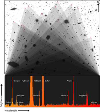
"Teenage galaxies" are unusually hot, glowing with unexpected elements : JWST spectra reveal that so-called "teenage galaxies" -- which formed two-to-three billion years after the Big Bang -- are unusually hot and contain unexpected elements, like nickel, which are notoriously difficult to observe. Light from 23 distant galaxies, identified with red rectangles in the Hubble Space Telescope image at the top, were combined to capture incredibly faint emission from eight different elements, which are labelled in the JWST spectrum at the bottom. Although scientists regularly find these elements on Earth, astronomers rarely, if ever, observe many of them in distant galaxies. This image accompanies a Northwestern press release here (and elsewhere online). The full resolution image is available here.

Credit: Aaron M. Geller | Northwestern | CIERA and IT Research Computing and Data Services.

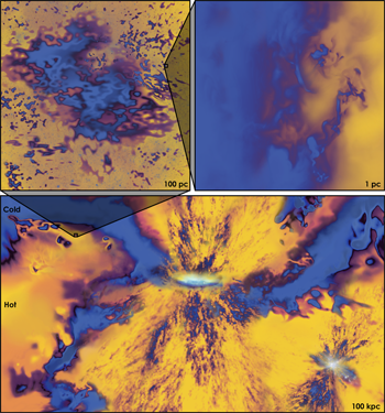
Bursts of star formation explain mysterious brightness at cosmic dawn : JWST images led some astronomers to claim early galaxies were too massive and too mature to have formed so soon after the Big Bang, leading some to question the standard model of cosmology. Simulations from the FIRE team show that these galaxies likely are not so massive, just bright. This image shows FIRE data of early starbursting galaxies. Stars and galaxies are shown in the bright white points of light, while the more diffuse dark matter and gas are shown in purples and reds. This image accompanies a Northwestern press release here (and elsewhere online). The full resolution image is available here.

Credit: Aaron M. Geller | Northwestern | CIERA and IT Research Computing and Data Services. The image was created by Aaron M. Geller using Blender and Photoshop and shows data from a FIRE simulation.

Unveiling the origins of merging black holes in galaxies like our own : 31.5 solar-mass black hole with an 8.38 solar-mass black hole companion viewed in front of its (computer generated) stellar nursery prior to merging. The distant band of the Milky Way can be seen toward the lower-left of the black hole pair. Light is warped nearby the black holes due to their strong gravity. This image accompanies a Northwestern press release here (and elsewhere online) for this Nature Astronomy article. The full resolution image is available here.

Credit: Aaron M. Geller | Northwestern | CIERA and IT Research Computing and Data Services. The nebula image was created by Aaron M. Geller using Blender and Photoshop. The Milky Way background image is from ESO/S. Brunier. Relativistic ray tracing was performed using the GeoVis code on the Quest high performance computing facility at Northwestern University which is jointly supported by the Office of the Provost, the Office for Research, and Northwestern University Information Technology.

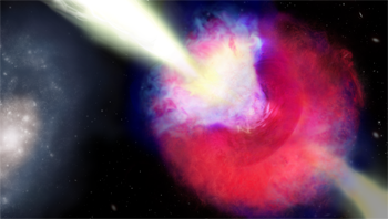
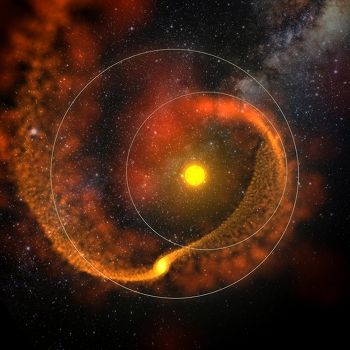
Kilonova and Gamma-ray Burst GRB 211211A : For nearly two decades, astrophysicists have believed that long gamma-ray bursts (GRBs) resulted solely from the collapse of massive stars. This new study at Northwestern uncovered evidence that at least some long GRBs can result from neutron star mergers, which were previously believed to produce only short GRBs. The illustration shows the kilonova and gamma-ray burst on the right. The blue color represents material squeezed along the poles, while the red colors indicate material ejected by the two inspiralling neutron stars that is now swirling around the merged object. A disk of ejecta emitted after the merger, hidden behind the red and blue ejecta, is shown in purple. A fast jet (shown in yellow) of material punches through the kilonova cloud. The event occurred about 8 kiloparsecs from its host galaxy (left). Read more in the Northwestern press release here (and elsewhere online). The full resolution image is available here.

Credit: Aaron M. Geller | Northwestern | CIERA and IT Research Computing and Data Services. Image created by Aaron M. Geller in Photoshop and Blender, in collaboration with Northwestern Prof. Wen-fai Fong and graduate student Jillian Rastinejad.

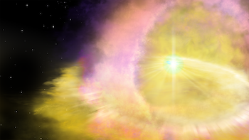
Calcium-rich Supernova 2019ehk : Most of the calcium in the universe - including the very calcium in our teeth and bones - was created in the last gasp of dying stars. Called "calcium-rich supernovae," these stellar explosions are so rare that astrophysicists have struggled to find and subsequently study them. The nature of these supernovae and their mechanism for creating calcium, therefore, have remained elusive. Now a Northwestern University-led team has potentially uncovered the true nature of these rare, mysterious events. Read more in the Northwestern press release here (and elsewhere online). The full resolution image is available with labels and without labels.

Credit: Image created by Aaron M. Geller in Photoshop, in collaboration with Northwestern Prof. Raffaella Margutti and graduate student Wynn Jacobson-Galán.

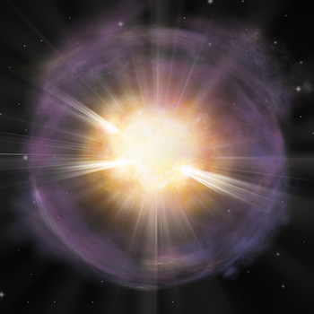
Brightest Supernova SN2016aps : A supernova at least twice as bright and energetic, and likely much more massive than any yet recorded has been identified by an international team of astronomers, led by the University of Birmingham and Northwestern. Read more in the University of Birmingham press release (and elsewhere online). The full resolution image is available here.

Credit: Image created by Aaron M. Geller in Photoshop, in collaboration with University of Birmingham Prof. Matt Nicholl.

Black Hole Encounter

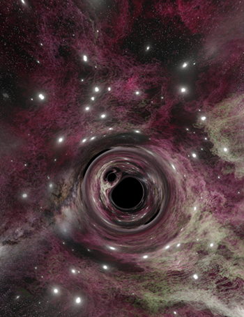
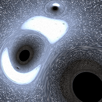
Black Hole Encounter : In late 2015, LIGO discovered gravitational waves emitted by two black holes (each with a mass of about 30 times that of our Sun) that spiraled together and merged about 1.5 billion years ago. Astrophysicists are now debating which is the most likely mechanism that can bring two black holes like those observed so close together. One important open question is: are the black holes born together, or do they find each other later in life? This image depicts the latter scenario, where multiple black holes are found within the heart of a dense globular star cluster (which contains hundreds of black holes and nearly a million luminous stars, simulated on a computer and observed here at an age of 2 billion years). During the very close gravitational encounter shown in this image, three black holes and one normal luminous star are engaged in a gravitational dance. One black hole and the normal star will eventually be flung out, leaving two black holes bound together in a very tight binary configuration. This black hole - black hole binary will later spiral together and merge, releasing gravitational waves similar to those observed with LIGO. Close encounters such as the one shown here are believed to happen frequently in globular clusters. In the image, the very strong gravity near the black holes bends the (normally straight) paths taken by the light emitted from the luminous stars, a phenomenon often called "gravitational lensing". Without the black holes, the viewer, who sits at the center of the globular cluster, would see a bright nearby blue-ish star straight ahead with a nearly uniform field of smaller, more distant, stars in all directions.

This image won 1st place and the People's Choice Award 2017 Northwestern Scientific Image Contest!

Credit: Image created by Aaron M. Geller. Monte Carlo globular cluster simulation performed by S. Chatterjee using the Northwestern CMC code. Black hole ray tracing simulation performed by A. Geller using GeoViS.

When Worlds Collide

When Worlds Collide : "Hot Jupiters" are Jupiter-like planets with orbits close to their host star. Their origins are debated, and some young planetary system may even host multiple Hot Jupiters. Here, we investigate a planetary system of two Hot Jupiters orbiting a Sun-like star. The system is born on the edge of instability, and over time, the planets' mutual gravitational perturbations increase their orbital eccentricities, leading to a dramatic collision that expels much of the planets' gaseous envelopes across the system. We study the initial orbit dynamics using an "N-body" gravitational integrator (Mercury), and the physical collision and thereafter using a hydrodynamics code (Starsmasher). This image (created in Maya) shows the collision remnant nearly one orbit after the point of first contact. Solid lines show the planet orbits just before the collision. The color gradient represents the gas column density. The background image shows the region observed by the NASA Kepler satellite, whose discoveries helped inspire this work.

This image won the People's Choice Award and an Honorable Mention in the 2015 Northwestern Scientific Image Contest! Here it is on Northwestern's DigitalHub. And it is featured on Northwestern's Research Tools website.

See also this version without the rings.

Credit: Image created by Aaron M. Geller. Simulation performed by J. Hwang, with F. Rasio advising.

Birth of a Solar System

Birth of a Solar System : Gas-rich "proto-planetary" disks surround young, still forming stars, feeding them through accretion of dust and gas. These are the birthplaces of planetary systems.This image shows a simulation of a possible gas disk progenitor for the real exoplanetary system HR8799. Today, HR8799 has four, six-Jupiter-mass planets, 30 million years into their lives, surrounded by a diffuse disk of planetary debris. With computational fluid dynamics simulations such as the one depicted here, we study the early lives of planets, still embedded in their birth proto-planetary disk, in order to understand how planetary systems like HR8799 came to be. In this image (created in Maya), the color follows the temperature, with white tracing the hottest (and generally densest) material. Four planets are clearly visible as hot dense knots, accreting gas and creating spiral patterns in the disk. The background image is 30 Doradus, the most active star-forming region known in the Local Group of galaxies.

Credit: Image created by Aaron M. Geller and A. Dempsey. Simulation performed by A. Dempsey.


Star Cluster Evolution in Stereo3D

Star Cluster Evolution in 3D : The "cross-eyed" stereo 3D image on the left shows a 500-million-year time lapse of a model star cluster similar to our Sun's birthplace. Points show the stars' initial locations, and lines trace their motion under the force of gravity. Stellar surface temperatures are translated into the visible colors that we would see from real stars. The two yellow regions towards the right mark supernovae. Finally, the thick white line highlights the path of a Sun-like star as it escapes from the cluster. The simulation was performed using NBODY6, and the visualization was created with partiview.

The two side-by-side images are from different vantage points, and can be combined to yield a "cross-eyed" 3D image in the middle. (See here for a useful tutorial.) I recommend clicking on (or downloading) the image to see the bigger version. Then try to align the white line first. If you are unable to see the 3D image please enjoy either 2D image or this 2D version.

This image won 4th place in the 2014 Northwestern Scientific Image Contest!

Credit: Image by Aaron M. Geller using partiview; dynamical calculation with stellar evolution performed using the NBODY6 code.

Blue Straggler Creation Through Mass Transfer

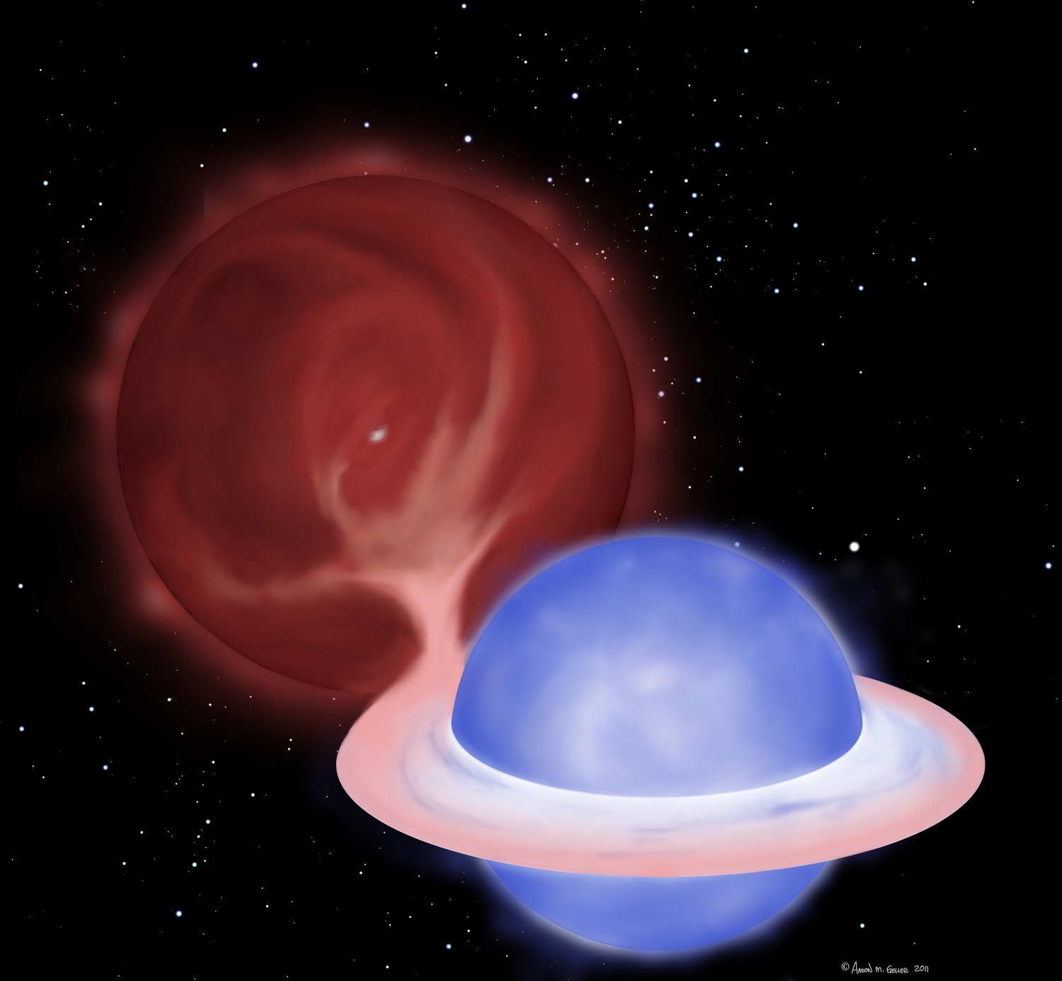
Creation of a Blue Straggler Through Mass Transfer : My artistic representation of a blue straggler being created by mass transfer in a binary star system. The giant star, seen in the upper left of the illustration, has lost hold of its outer envelope. This material is pulled towards its partner, forming an accretion disk, and is eventually consumed by the "proto-blue straggler", seen in the lower right of the illustration. Soon the giant star will donate the remainder of its envelope, leaving only the half-solar-mass white dwarf core (shown peaking through the giant's tenuous envelope) as the companion to the blue straggler. I created this image to accompany our press release for Geller & Mathieu (2011)

This image was featured in news articles for our 2011 Nature Letter.

Click here for a larger image, and if you want a full resolution version, please email me at the address given below.
Format: jpeg
Credit: Aaron M. Geller


Back to top

Misc.
AoT Chicagox

Astronomy on Tap Chicago : Northwestern/CIERA, the University of Chicago and the Adler Planetarium have joined forces for Astronomy on Tap Chicago! Each FREE event features accessible, engaging science presentations on topics ranging from planets to black holes to galaxies to the beginning of the Universe. I developed the logos and various advertising materials for our Northwestern/CIERA group.

AoT Chicagox AoT Chicagox


Back to top

Teaching
IDEAS Banner

IDEAS Visualization Course : I teach a course on visualization for the Northwestern IDEAS graduate students. The current version is a two-week intensive course focussing on python+matplotlib, D3, and GMT, with a survey day that covers a very wide range of other software; we currently have materials to demo Bokeh, cartopy, datawrapper, ffmpeg, Illustrator, ImageMagick, ggplot2, Maya, ParaView, Photoshop, Plotly, Processing, PyOpenGL, R-shiny, seaborn, WebGL and x3dom. (This list is updated each year.) Students in the course develop their own visualization projects for their research. For more information, and to download course materials, please see my GitHub site here.


Back to top