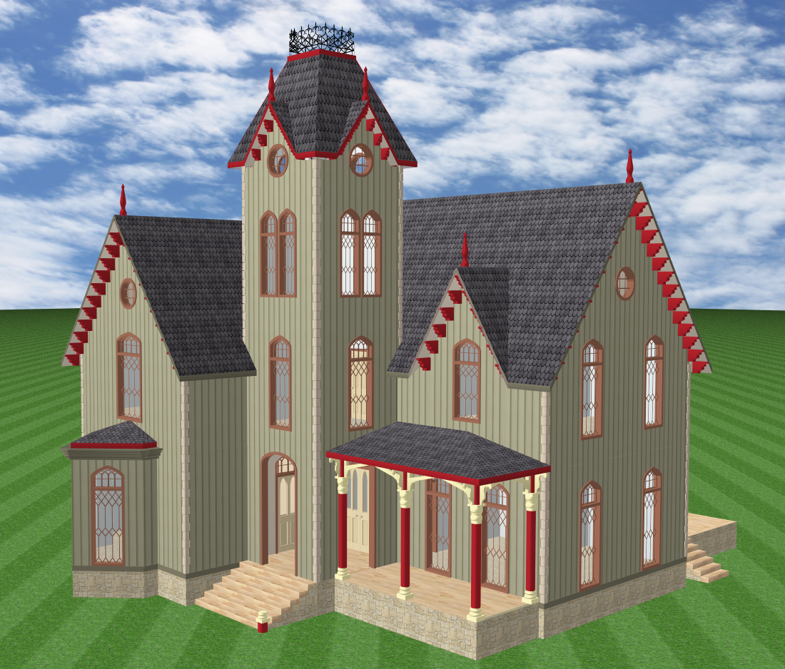
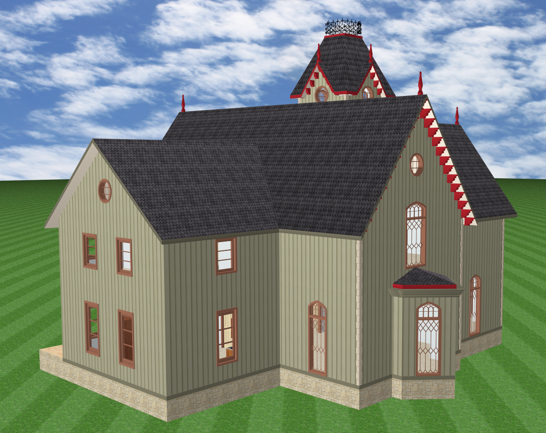
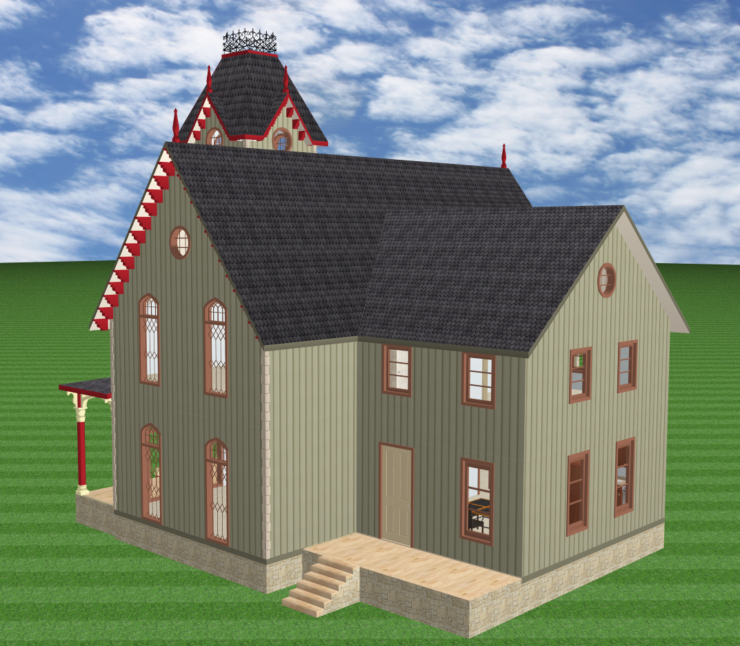
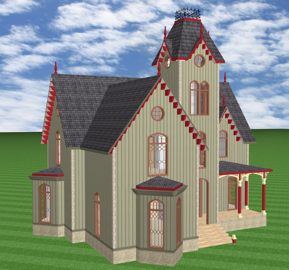
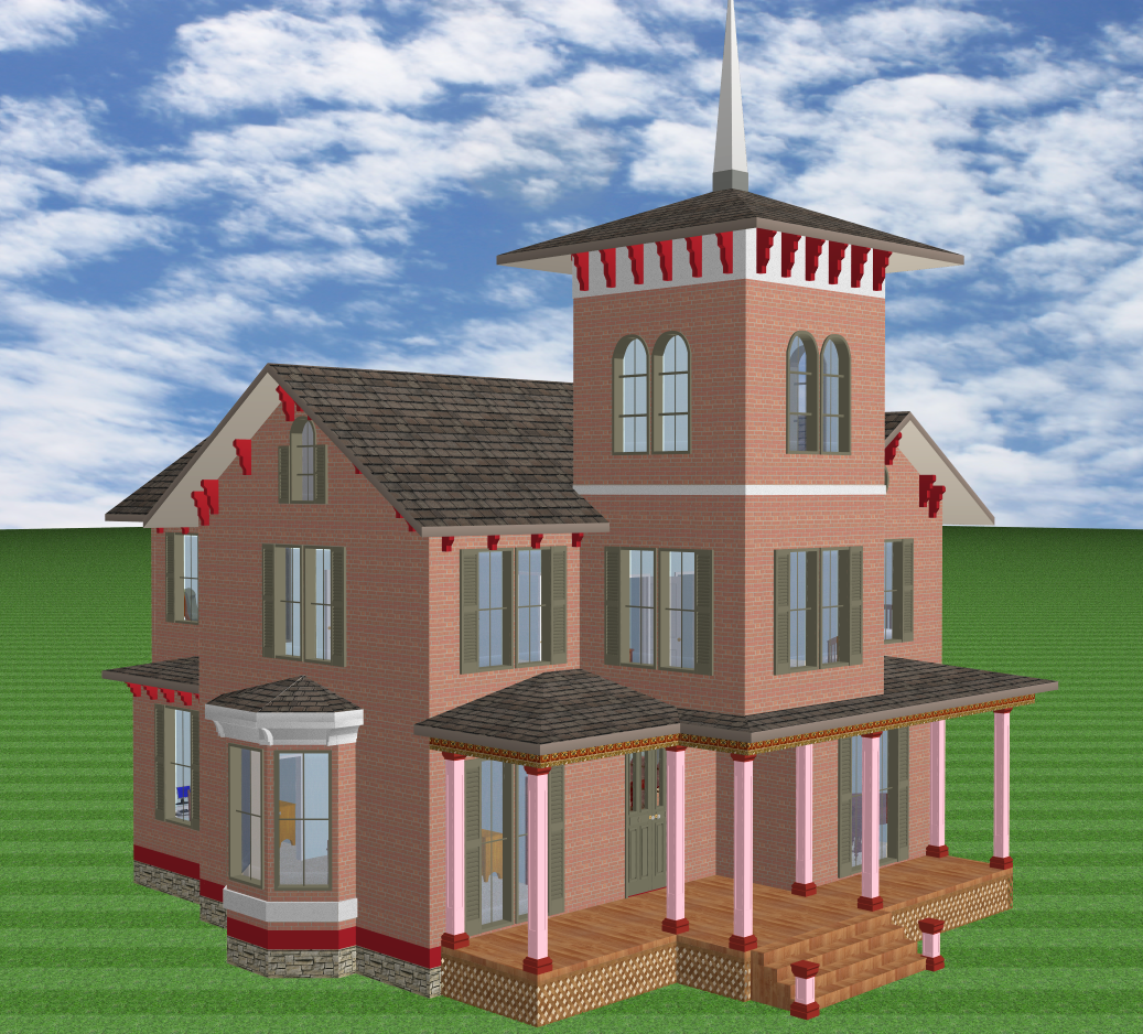
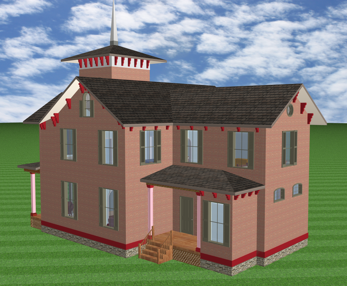
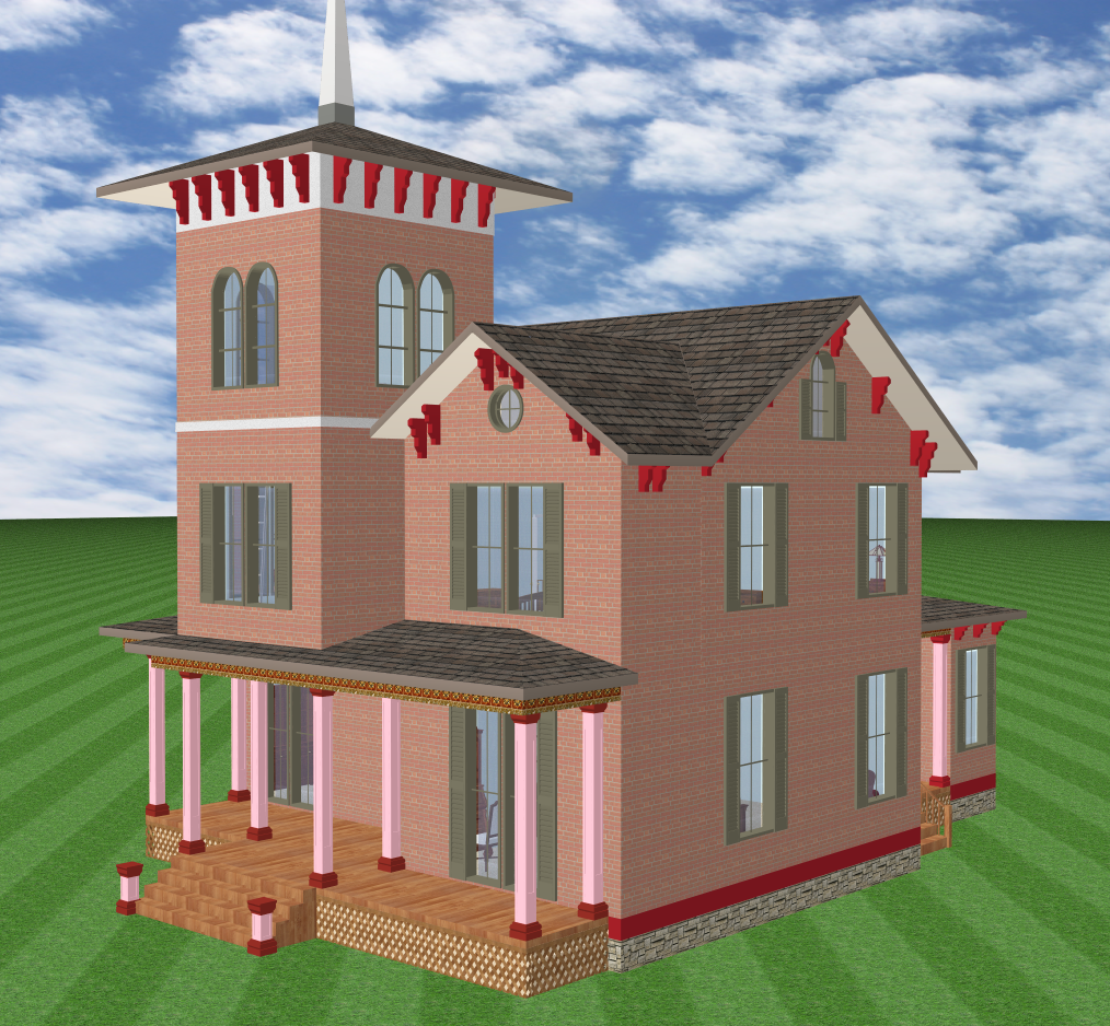
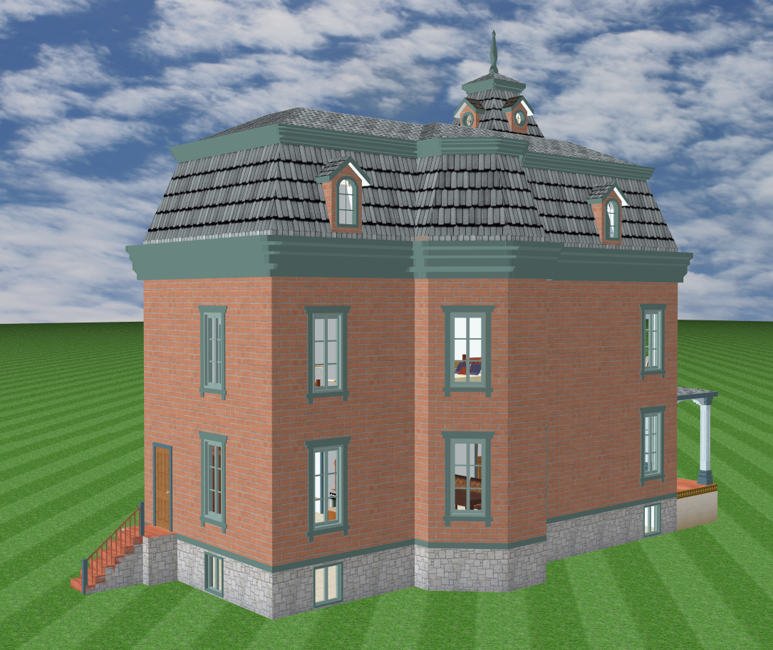
 Gothic Revival
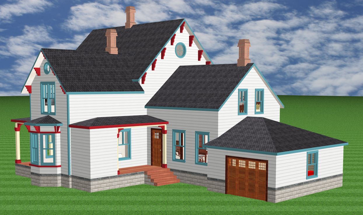
This is the style that heralded the dawn of Victorian architecture, so of course it is featured as the first model in my gallery. This house, which was designed in 1859, has most of the characteristic features of the Gothic Revival: for example, the siding is vertical rather than horizontal, to better create the illusion of height. It has very sharply peaked roofs with decorated eaves, including those on the dormers. The windows also have a peaked style, and elaborate lattices reminiscent of church windows. The bay windows have a distinctly Gothic flair featuring only two sides, which meet at a 45-degree angle and create a sharp edge in tune with the peaked roof. The top of the house is festooned with tall pointed finials, adding to the illusion of height. And last but certainly not least, the whole affair is crowned by an amazingly useless tower where the third story can only be reached by using a ladder, and the fourth story exists for no reason except to support yet more height, an incredible roof, and a decorative wrought iron crest.
By the way, the kitchen extension I created at the back of the house is completely authentic. It is very plain, with simple square windows, no brackets along the roofline, no finials, and even the porch is just planks with no roof. For the most part, Victorians spent their money where it could be seen, and thus it was very common for all the lavish decoration on the street side of the house to vanish completely when you came around to the back. If you look carefully, you might notice that the rear section even has lower ceilings than in the front. This odd bit of construction might have saved a bit of money, I don't know, but it also meant that you had to construct inconvenient and even hazardous steps at every second-floor doorway between the front and back. Why was it so commonly done? Well, as far as I can tell, it was mainly done to play mind games, i.e., to literally place the family's rooms above those of the servants.
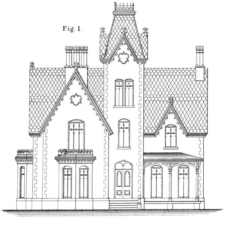
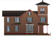
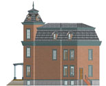
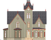 Let me give you an idea of what was involved in creating my 3D models. The black-and-white image at far right was the inspiration for the Gothic house. (It is in fact the cover image on one of my architecture books.) The color image is my 3D version as viewed from the front, and thus you can see the similarities and differences for yourself. I did not try to exactly reproduce the original drawing, but I certainly used it to help get all the Gothic details right.
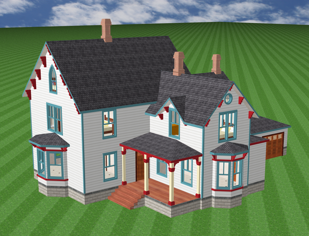
 Farmhouse
This is just a farmhouse, which could have been built at any time between 1880 and 1950, but its quintessential peaked roof still contains echoes of the Gothic Revival. It has also retained its eave brackets, reflecting those roots. I added a modern garage in the back to show how the house might really look in the 21st century. There are still chimneys on the house, which is an oddity for me, because by and large I am unsympathetic to fireplaces. I consider them to be utterly useless and expensive in the modern world, so I did not include any in the other drawings in this collection.
 Italianate
One need not peruse this web site for long to notice that I am slightly dotty about Victorians with towers. For the most part they didn't make much economic sense, but gosh did they look grand. As soon as I saw the sketch of this house, I knew I had to transform it into 3D, because it has a tower with no floor beneath it! Instead it looms in midair above the porch, supported by only four slender pillars. This house has many features characteristic of the Italianate style: it not very symmetrical, and in fact it seems to be made of rectangular chunks just shoved together. The roofs are relatively flat, especially on the tower, even though it does have a decorative spire. The eave brackets are notably thick and heavy, yet the house has no applied decoration at all on its outside walls.
 The little video at left gives you a better idea of how long and large this house is. (I had to clip off the tall spire to get the house on the screen.) Should you be wondering, no, my architectural software has no ability to export movies. Instead I used the handy Mac OS X feature which allows you to screen-capture anything on your monitor. I simply turned it on, rotated the house by hand, then ran the screen-capture through a converter to generate an mp4 file.
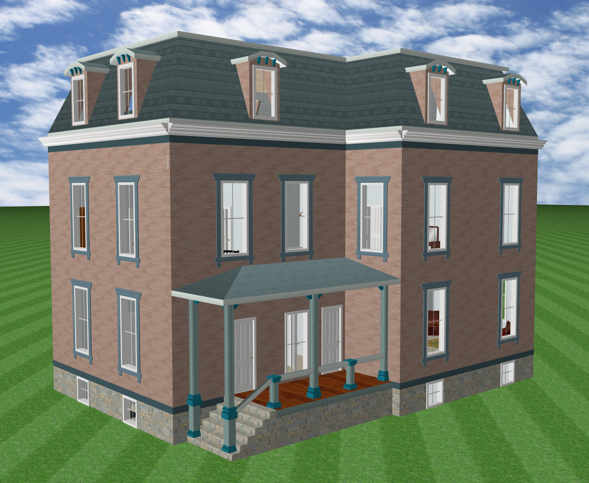 Second Empire
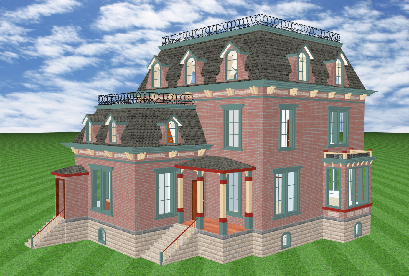
I am highly partial to the Second Empire style. At its best, it exudes a haughty formality that is unmatched by any other Victorian design. The main feature of the Second Empire is the two-part mansard roof, the lower part highly sloped and punctuated by many dormers, and the higher part almost flat. The term "Second Empire" refers to a period in French history when the roof was particularly popular in Paris, and "mansard" comes from Francois Mansart (1598 - 1666), an architect who used such roofs extensively. A 1783 law had limited Paris buildings to 65 feet in height, and the mansard roof was a way to stuff more space into the attic and stay within the law. There was no such law in the United States, but folks built mansard or "French" roofs like mad anyway, because they loved the look. I love it too, but even I have to admit that from almost any viewpoint of practicality or economy, it is far more efficient to just go ahead and build your blinkety-blank third story with full, tall walls and put a simple roof over it, if you really need a third story. In truth, I never realized the sheer complexity involved in creating rooms with slanted ceilings and a flock of complicated dormers piercing the slanting until I had to create them myself with my CAD software. Wow. Talk about job security for carpenters – the Second Empire style was nothing if not that.
 The design shown here had arched dormer roofs in the original drawings, but since my software cannot create an arched roof in a dormer, I did the next best thing and put in octagonal roofs. And they don't look bad at all, in my opinion. Actually, the most technically challenging aspect of this particular house was creating the double-story octagonal bays, with the second-story bay clearly smaller than the first but still perfectly symmetric with it. I celebrated this little triumph by putting some lamps in the windows.
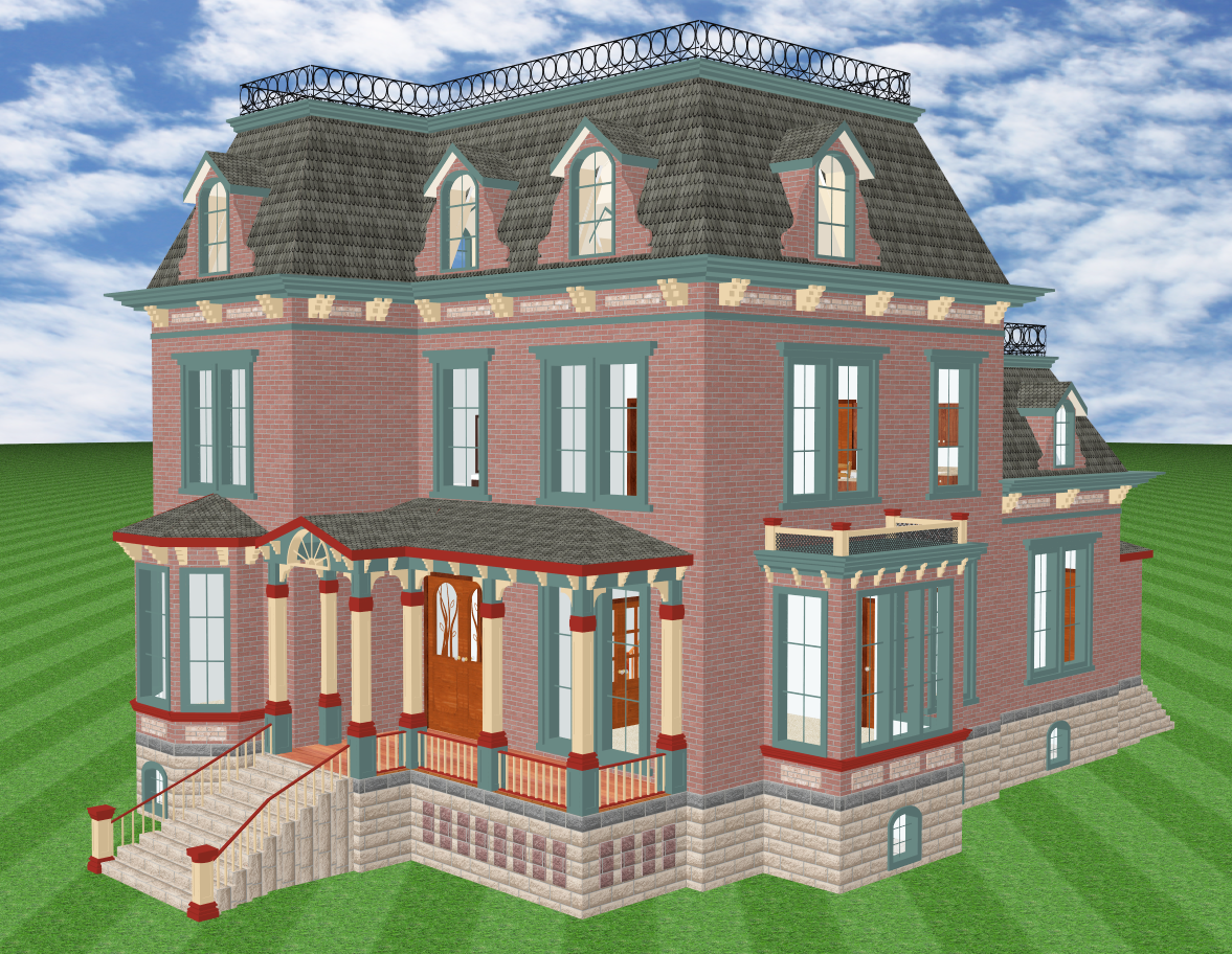
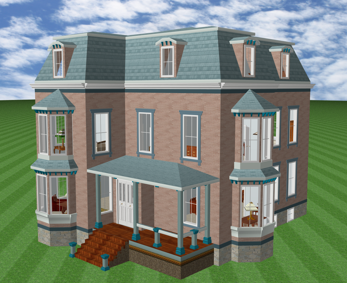
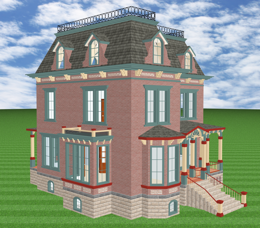 Second Empire
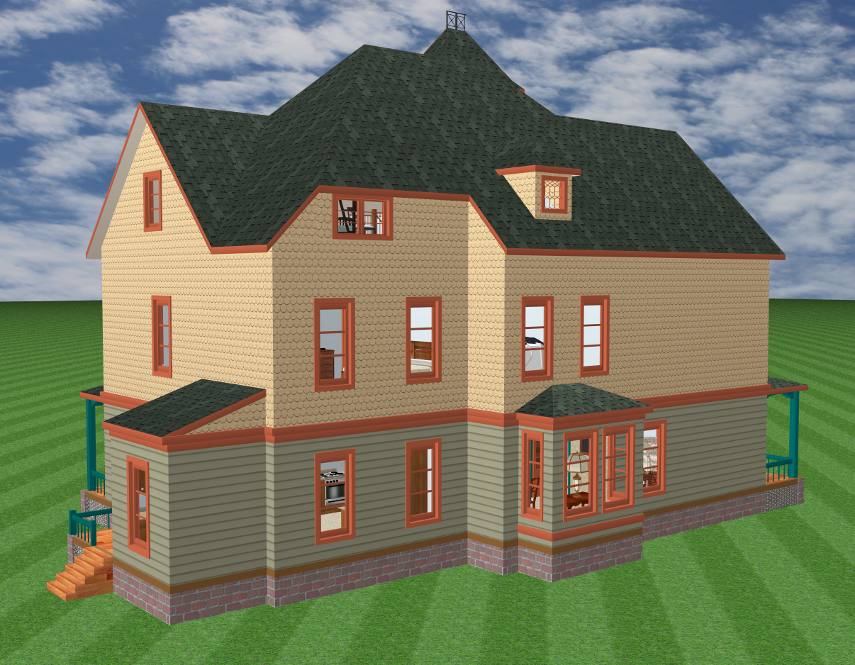
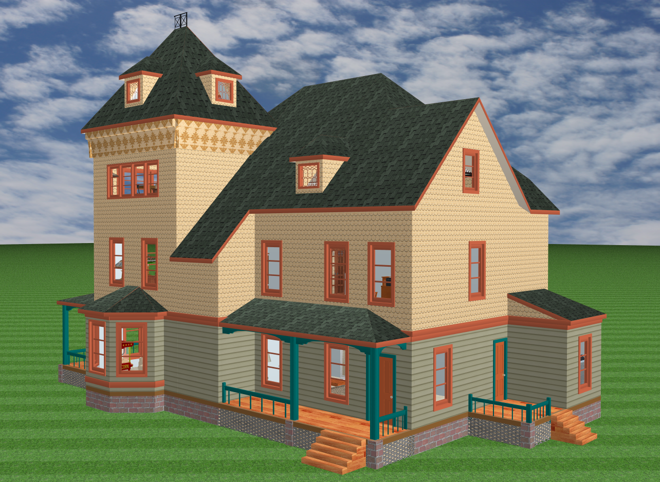
This is a Second Empire mansion, designed in the 1870's by George Woodward. The original was elaborate, so I had to pull out all the stops to convert it to 3D. The inset brick panels both black and pink had to be inserted one at a time, by hand. And the brick flanges on the dormers also had to be specially created and then inserted one at a time, by hand. Even the porch pillars had to be specially created, and inserted by hand, because the standard column feature included with the software will not allow you to give them five bands of color. The things you do, just to indulge in a hobby . . .
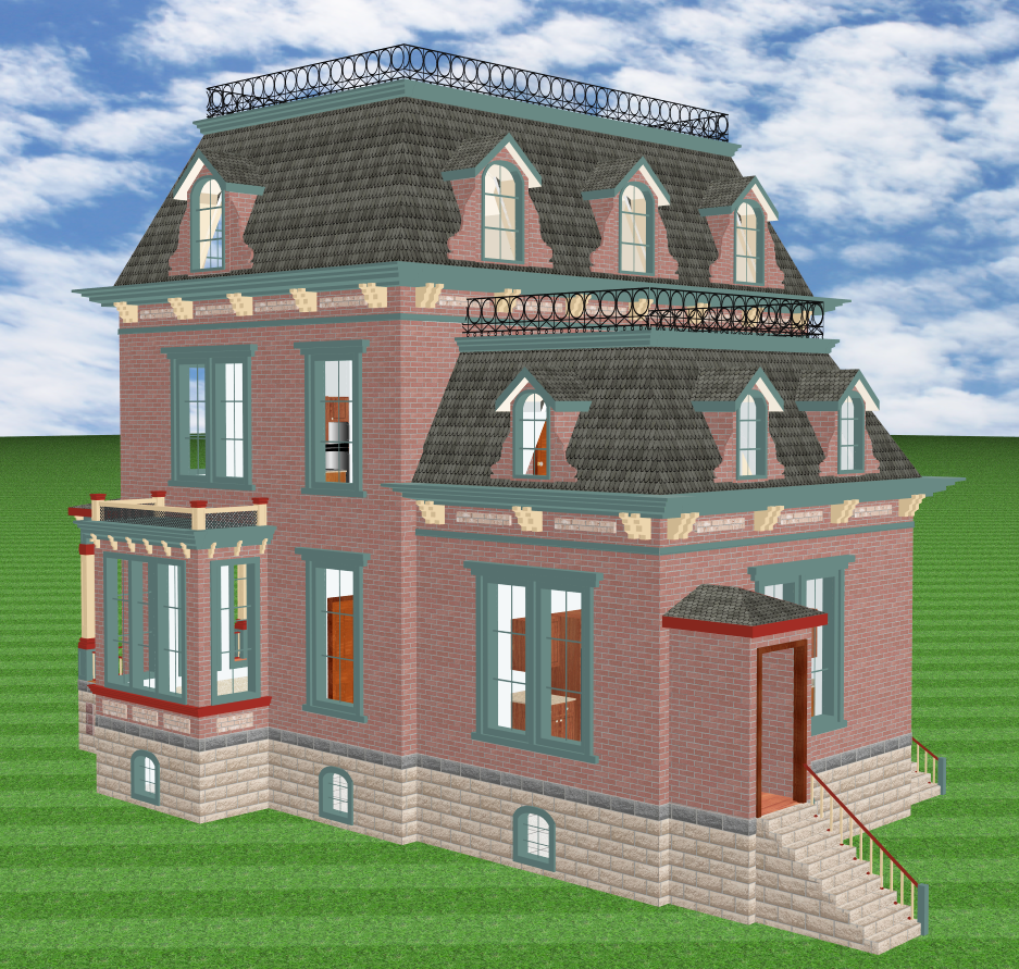 I had a drawing of one side of this house as well as the usual front drawing, which means that the lower ceiling heights in the kitchen extension are original to Woodward, not to me. Wealthy Victorians really did like to live a few feet above their servants. The odd little back stoop with its protected entry is also original to Woodward; I presume the idea was to more efficiently keep tradesmen from getting wet.
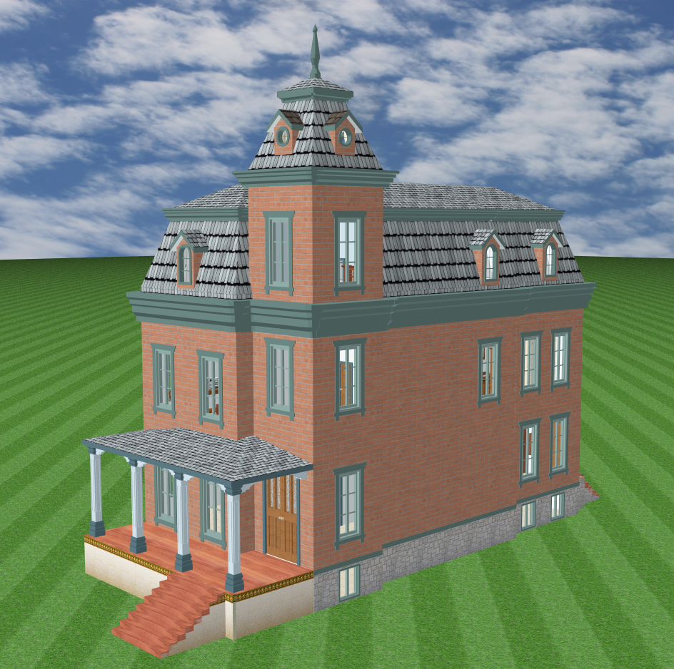
 Row House
This is a model of a modest Victorian row house, meant for an urban environment rather than the country. During the Victorian age, it was common in cities to assess real estate taxes by how much footage the house occupied along the street, rather than on overall value as we do today. The inevitable result was houses that occupied as little street front as possible, while still having enough volume to make a suitable home for a middle-class family. In other words, urban Victorians often built their houses narrow but deep and high, just like the model here.
 This particular house seems to have a tower, but it really doesn't. Upon closer inspection you can see that the third-story walls of the "tower" are really just a small section of flat walls placed along the Second-Empire mansard roof. Unlike the tower in my Gothic Revival model, this tower contains perfectly usable space that connects to the rest of the third story. The slightly offset walls below the tower, the different heights of its windows, even the nice fourth-floor cap, are all just illusions meant to make it seem that the building has a tower in the corner. In fact, it only has a modified third-story room and a little sleight of hand. I love it.
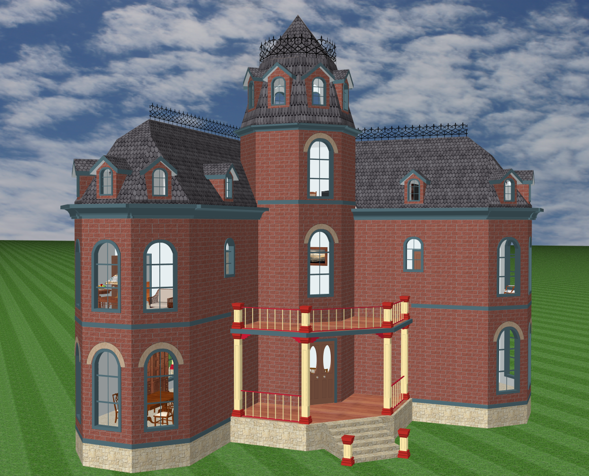
 Octagon House
The octagon house enjoyed a certain vogue during the 1860s, so here is my take on a very elaborated version (with a Second Empire roof, of course). The central tower is indeed a perfect octagon, and the projecting wings end with octagonal window bays. The tower has eight dormers, naturally, and this gives it an almost sinister cutting-tool look that I tried to alleviate somewhat by giving the house a colorful porch. But I don't know. Perhaps I should have gone with the flow and given the house a dark-colored Gothic porch to make it look even more sinister. I will think about it.
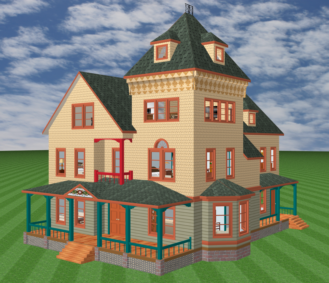
 Queen Anne
When it comes to creating a 3D model, the Queen Anne style usually represents a frightening challenge. Queen Annes are normally covered with elaborate gingerbread that is impossible to reproduce with consumer software, and ruinously time-expensive to produce with professional software. Fortunately, "normally" doesn't mean "universally" and Queen Annes don't always groan beneath the weight of all their bric-a-brak. I realized that I could create a perfectly authentic 3D Queen Anne if I just included the basic tenets of the style and disposed of most of the architectural jewelry, and this model was the result.
 Queen Anne houses are characterized by asymmetry. This house has a farmhouse look on one side, but an immense, almost castle-like look on the other. (And here again, we see a "tower" that isn't really a tower. The square section of the house on the third floor is simply some taller walls capped by a high observation deck.) The first floor has an octagonal bay on one side, and a square bay on the other. There is a fake porch on the second story. But perhaps the most telling feature of the Queen Anne is the asymmetry in its siding, which we have here. The first story is covered in green clapboard, but the higher stories feature yellow scallop shakes.
 One of the side-effects of so much asymmetry is that the roofs on Queen Annes must also be asymmetric, yet still of course meet seamlessly to keep out the elements. The result of this dual demand is often surprising. The roof on this Queen Anne rises to an incredible height, so far above the third floor that it rivals the observation deck, but this is not due to architectural whimsy. No. The roof must rise like this because there is literally no other way to piece together all the wall segments and still turn the rain. The final result may look elegant and inevitable, but in fact it took me days to put a roof on this house. My only clue was a tall shadow on the front-facing sketch, as seen at left.
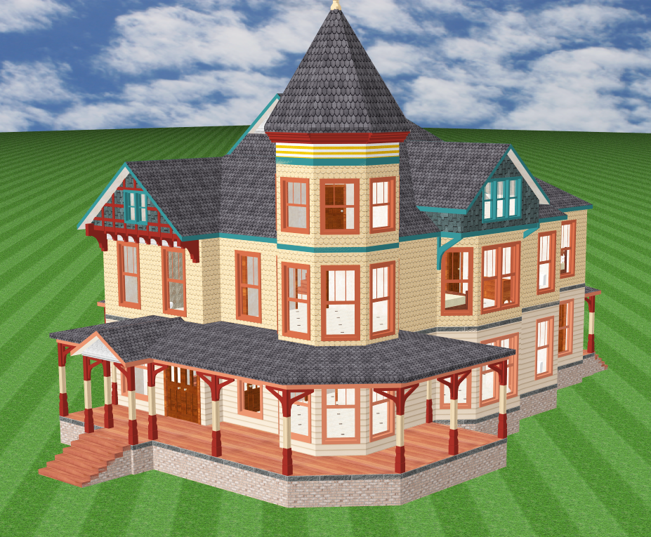
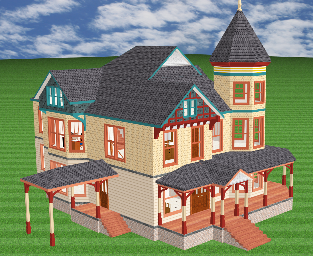
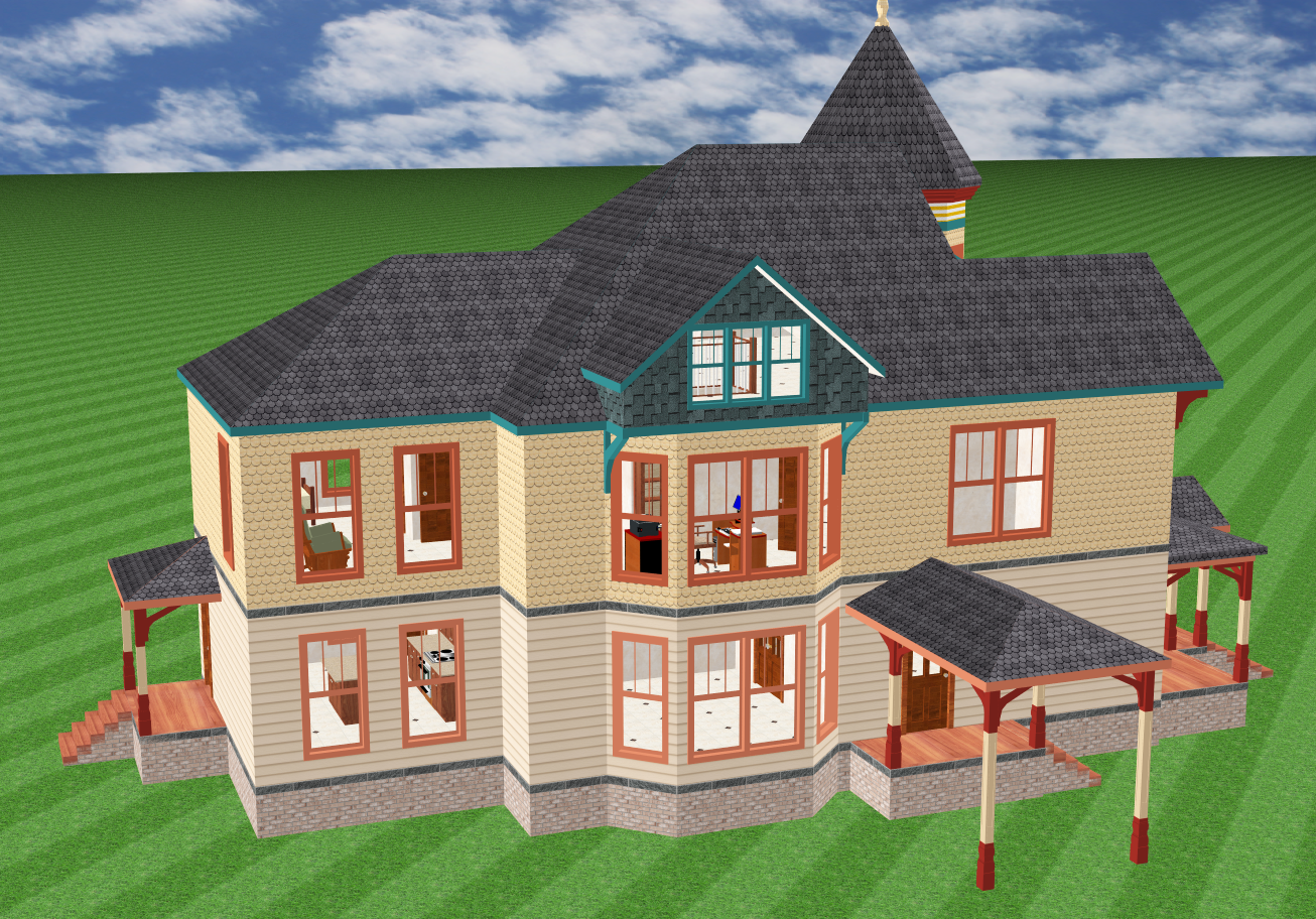 Queen Anne
Here is my second try at creating a 3D Queen Anne model. This one has a large porte cochere and features a more popular corner tower as compared to the first house. However, the most notable elaboration evident in this house is the way the third story is handled, complete with supporting brackets and a spectacularly complex roof.
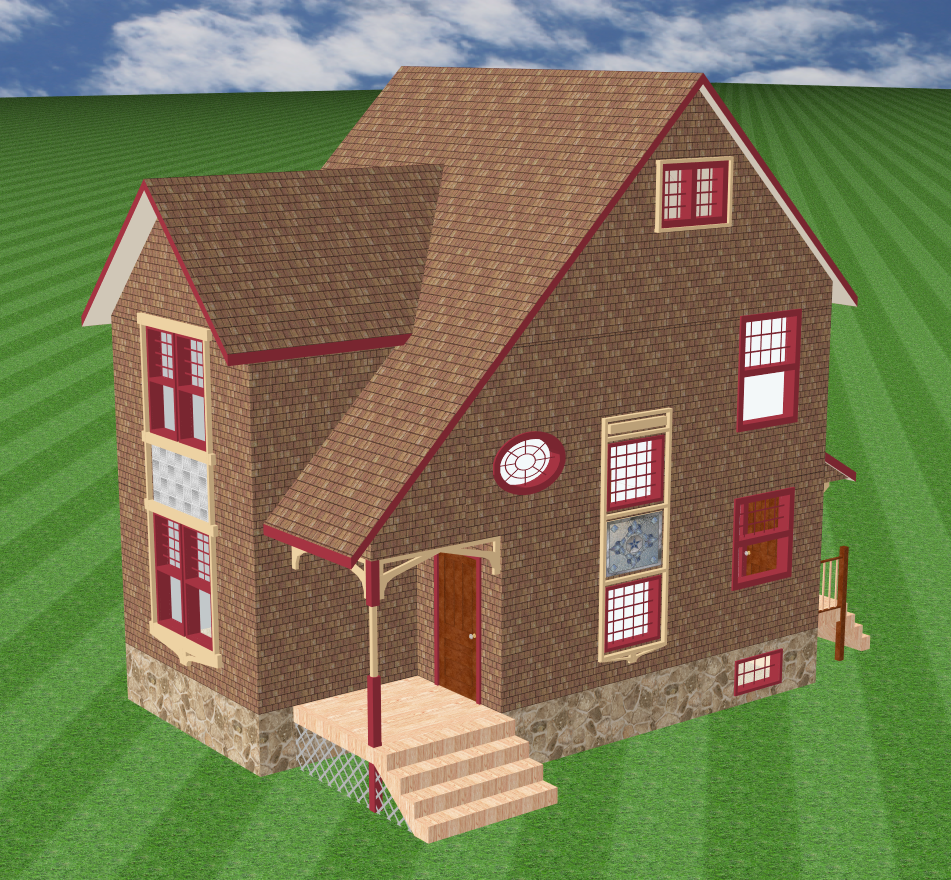
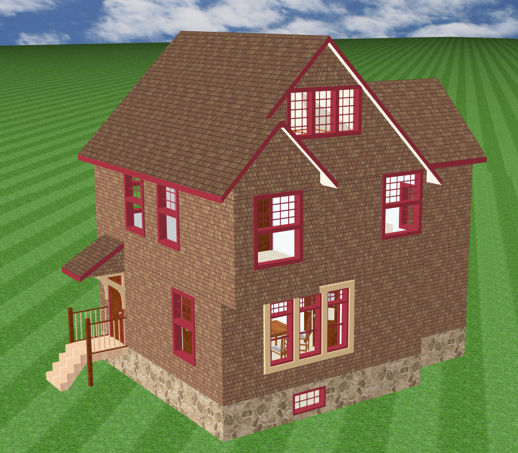
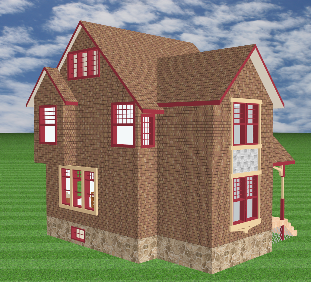 Shingle Style
The Shingle Style tends to be the Victorian design that gets no respect. Originally it was only intended for cottages by the seashore, although some wealthy Victorians took the style to ludicrous limits and produced "cottages" that had 60 rooms. But in fact the Shingle Style was more original than all the other popular Victorian styles, because it did not hark back to anything from Europe. It was what it was, and not a reinterpretation of something else. The reason it was called the Shingle Style is because houses built in the style were literally covered in shingles, from the roof peak to the basement. The style tended to have large and bulky roofs, neither sharply peaked like the Gothic nor nearly flat like the Second Empire. Varied window treatments were OK, as was a decorative panel here and there, but otherwise the Shingle Style almost completely ignored decorative gingerbread. My take on the style is the true cottage shown here.
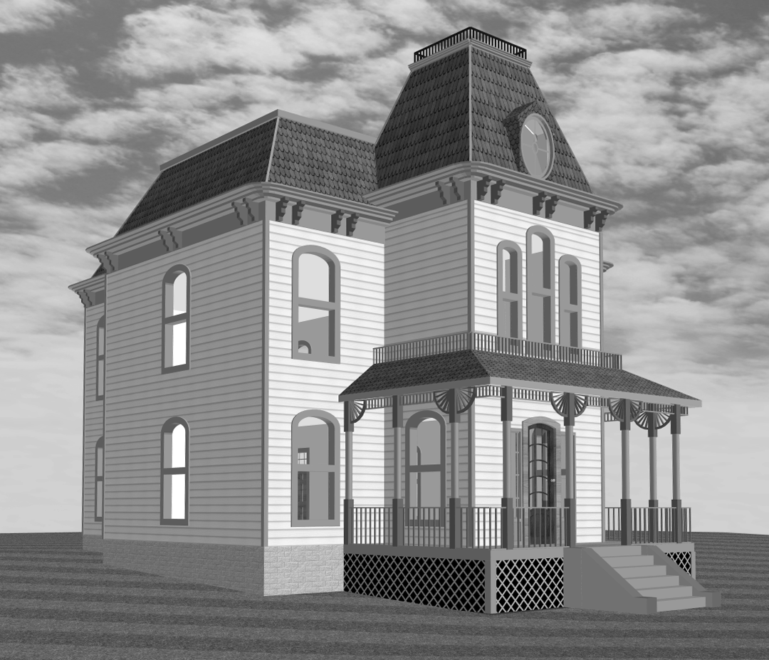 Movie House
And finally, for a little fun, we have a model of perhaps the most famous Second Empire house of all time, or at least the most famous one that people believe they've seen. In fact the movie it starred in only filmed the house from one vantage point, looking up the ominous staircase on the hill, and therefore the set designers only built two sides of the house, and even they were just fake fronts. There is no original house from that movie; only copies made later on. In any case, my version is as accurate to the movie as I could make it, right down to the exact gingerbread highlighting the porch. I even ran the picture through Photoshop to turn it into black-and-white, because that's how the movie was shot. I hope you enjoy it.
And exactly what is the name of this movie, you may ask? Well, honestly folks, if your knowledge of classic American cinema is so paltry that you don't know already, then it is time you did some research and found out on your own. The chase will be worth the prize at the end.